healthcare-website-navigation-best-practices

9 Best Practices for Healthcare Website Navigation

14 December, 2023 | 7 Min Read | By Swapnil
  • Category: Website CMS and Digital Marketing
  • An eye-catching healthcare website design isn’t just about aesthetics and content - it’s about seamless website navigation, too. Navigating healthcare websites should be as straightforward as finding your way through a hospital’s corridors.

    In this blog post, we delve into the significance of healthcare website navigation and explore some essential best practices that hospitals and practice groups should follow. Let’s begin.

    Table of Contents

    1. What is healthcare website navigation?
    2. Why is good website navigation design important in healthcare?
    3. Healthcare website navigation best practices

    What is healthcare website navigation?​

    Website navigation is the process of effortlessly moving around a website to locate information and access different sections. In terms of healthcare website design, site navigation involves how patients and other website visitors explore the services, medical information, and contact details of your hospital or practice group.

    A smooth medical website navigation design enhances the user experience, making it easier for patients to find what they need quickly.

    Why is good website navigation design important in healthcare?​

    Effective healthcare website navigation design is crucial for two reasons:

    Better user experience

    Visitors to healthcare websites often come seeking vital information, such as medical services and contact information.

    A well-designed navigation system ensures that patients can access this information with minimal effort, resulting in a positive user experience. And the faster your website meets their needs, the more likely they are to perform the desired action, such as booking appointments.

    So, a simplified hospital or medical practice website navigation helps boost conversion rates as well.

    Accessibility

    All kinds of patients, including those with different abilities, should be able to easily navigate your healthcare website. Designing an accessible website contributes to a more inclusive online environment for everyone.

    Healthcare website navigation best practices​

    Here are some best practices for website navigation on a healthcare site:

    1. Effectively structure your healthcare website navigation​

    Think of a roadmap for your healthcare website’s visitors when designing its navigation. If they were to visit a specific page on your site, what route would they need to take?

    Incorporate the routes for each web page into your healthcare website outline. Based on that outline, divide your website’s content into logical categories reflecting your patients’ needs and interests.

    For instance, a website visitor might want to know more about the services your hospital offers. Or they might need information about your hospital’s locations before booking an appointment with a doctor.

    That’s why it’s best to focus on the most critical sections that directly address site visitors’ common queries, such as ‘Services’, ‘Locations’, and ‘Contact’.

    You can even segregate services by medical specialty (Pulmonary services, Cardiology, Orthopedics, and so on). For example, hovering over the ‘Services’ link on this hospital website makes a dropdown menu appear, listing the different specialty services it offers.

    Website navigation practifly navigation menu

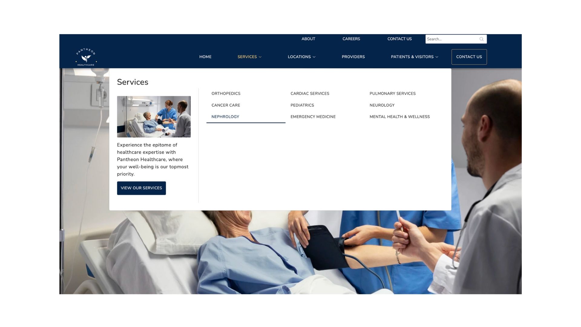
    Further, creating subcategories under each specialty can stop visitors from getting confused with too many options at once.

    Such a hierarchical structure guides patients intuitively to the information they seek, enhancing their overall user experience.

    2. Limit the number of primary navigation menu items​

    When it comes to healthcare website navigation design, less is more. Keep around 5 to 7 items in the primary menu, so patients don’t get overwhelmed. Too many options can clutter the navigation and prevent them from quickly finding what they need.

    3. Consider adding a secondary navigation menu​

    A secondary menu contains links that are less important than those in the primary navigation menu, but are significant enough to be featured in the header. Having a secondary menu can be a good idea for hospitals with a vast array of services, departments, and resources.

    So, a secondary navigation menu might have links to pages like ‘About Us’, ‘Careers’, and ‘Patient Login’.

    In this example, Massachusetts General Hospital’s website shows the secondary navigation links towards the top right of the screen.

    Website navigation practifly secondary menu
    This helps keep the primary menu uncluttered, maintaining a clean design while still providing comprehensive information.
    Website navigation practifly header
    A sticky navigation menu bar also comes in handy if that menu features a call-to-action (CTA) button that patients can click, no matter how far they’ve scrolled down.

    5. Use short menu titles​

    Clarity is key in medical website navigation design. Long menu labels or titles can make your healthcare website look chaotic, especially on a mobile phone. So, use clear and concise labels for all your menu items.

    For example, ‘Find a Doctor’ is more patient-friendly than ‘Meet Our Expert Medical Professionals’.

    However, keep in mind that not only should the title be short, but it should also be descriptive and easily understandable. Each menu title should clearly convey the purpose of each item as well as the content behind each link.

    Let’s say a menu is simply labeled ‘Doctors’. This title might make some patients think it’s a page created specifically for doctors. Meanwhile, others might be of the notion that this page is a place to find a doctor. See the difference?

    6. Make your CTA buttons stand out​

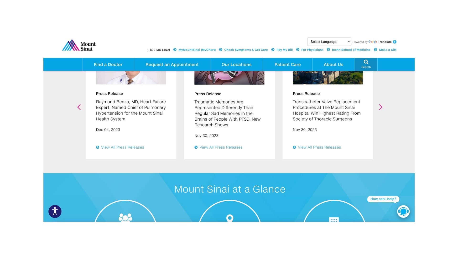
    Use distinctive colors contrasting your healthcare website’s palette to prominently display calls-to-action (CTAs). This will help instantly catch the website visitor’s attention.

    Moreover, action-oriented text, like ‘Book an Appointment’ or ‘Contact Us’, can encourage the visitor to click the button. Placing the CTA button in the primary navigation menu also makes it more likely for them to click it.

    7. Link your logo to your homepage​

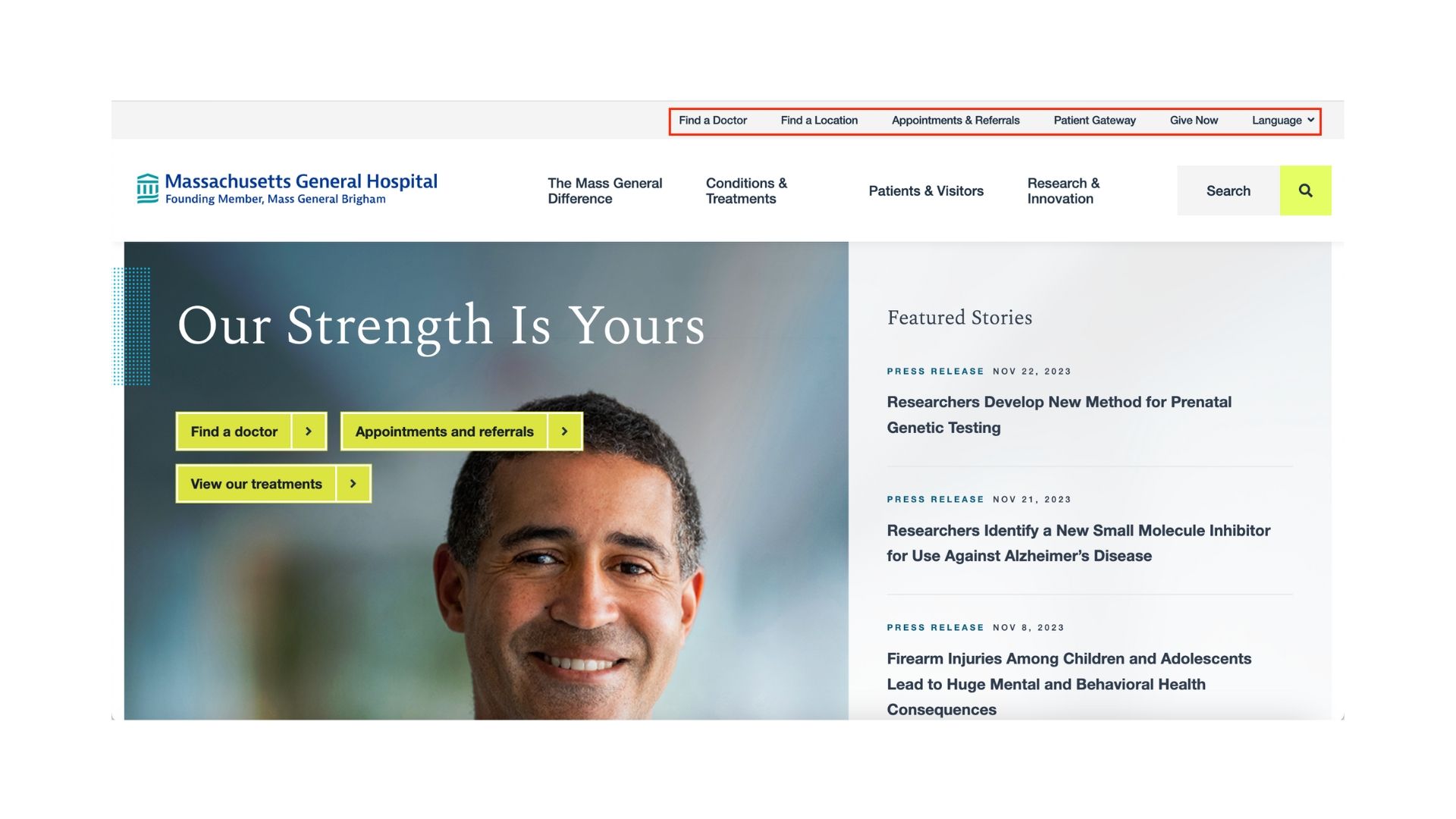
    Apart from displaying your brand identity, your healthcare logo should be a secondary link to your homepage. In short, clicking on the logo should take website visitors back to the homepage, regardless of the page they’re on at that moment.

    This enables quick navigation back to the main entry point of your website. For that reason, it’s a simple yet effective way to provide a patient-friendly navigation experience.

    8. Don’t forget the footer​

    The footer should serve as a navigation hub for patients who have scrolled to the bottom of a page. They shouldn’t have to scroll back up to the top of the web page only to access any link from the header.

    How so?

    Well, the header might not feature all of your website links. In that case, you can add any remaining links in the footer, along with the links added in the header.

    These footer links may include your medical logo, contact information, social media links, and a sitemap housing all your website’s links on a single page. You might also add essential links such as ‘Privacy Policy’ and ‘Disclaimer’.

    Take a look at the footer on the website of Massachusetts General Hospital. All the links there are organized in a clean and easy-to-understand way.

    Website navigation practifly footer

    9. Ensure your healthcare website navigation is mobile-responsive​

    Many patients access healthcare websites from mobile devices. Your medical website navigation design should adapt seamlessly to different screen sizes (mobile, desktop, and tablet), ensuring a consistent user experience.

    For example, consider a hamburger menu for mobile devices. It condenses the menu into a three-line icon that, when clicked, reveals all the navigation menu items.

    You can get an idea of the hamburger menu from Cleveland Clinic’s mobile site.

    Website navigation practifly mobile navigation

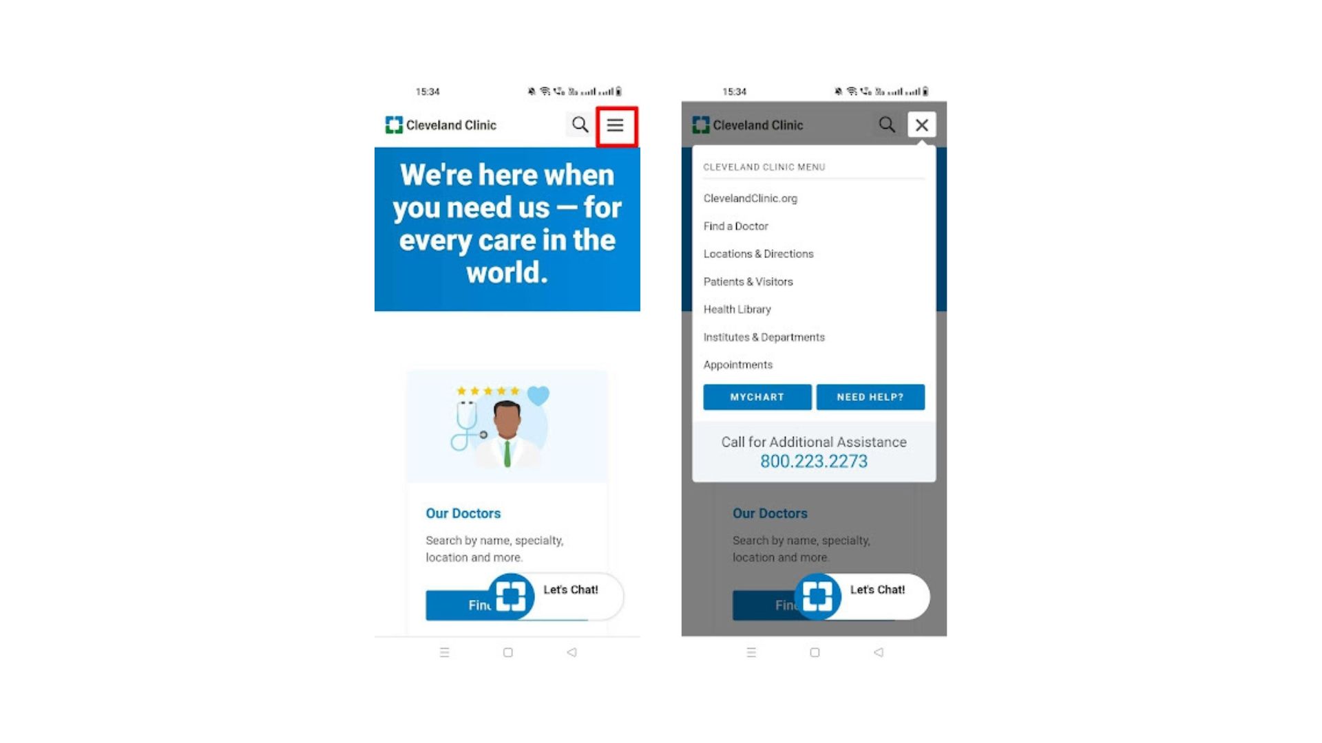
    Of course, while designing a healthcare mobile navigation menu, make sure the links aren’t too small for website visitors to tap them easily.

    Design a healthcare website that’s easy to navigate​

    Whether you’re just launching your practice group or you own a well-established hospital chain, healthcare website navigation is crucial. If you want your site visitors to become your new patients, you need to follow the above website navigation best practices.

    But there’s an alternative - let us enhance your patients’ website experience by adhering to these best practices on your behalf, while you focus on treating your patients.

    At Practifly, we can help your hospital or practice group with a healthcare website design that caters both to your patients’ needs and your website goals. Our design experts ensure that it’s easy for your site visitors to find their way around your website and become your patients. Simply set up a 10-minute call here, and you’re good to go!

    Stay on Top of Everything in Healthcare IT

    Join over 3,200 subscribers and keep up-to-date with the latest innovations & best practices in Healthcare IT.

    Related posts