
How to Track Search Intent of Likely Patients: A Beginner’s Guide
The way patients interact with your practice often begins long before they ever set foot in your office. It …

Your website is the most significant element of your digital marketing strategy to grow your medical practice. That’s why you need to pay attention to your medical website design.
The concept of design is elusive, though.
How? Well, when you visit a medical website, you can differentiate between a good design and a bad one. For example, it’s easy for you to point out if the logo looks too big or if the site is too colorful.
But sometimes, even a professional website designer might find it difficult to explain why a certain healthcare website design looks good or bad - they just know it in their bones. Just like a surgeon might have a hard time explaining the intricacies of proper intubation, even though it might be a run-of-the-mill procedure for her. Since she’s done it countless times, it’s no longer just a procedure for her, but a gut instinct.
Read: 7 Signs It’s Time to Upgrade Your Medical Website
Think about it - it’s hard to imagine a complete design for a medical practice site from scratch.
Basically, it should meet all of the following requirements:
Taking care of all these criteria is not a simple task, especially for doctors. This blog post describes several factors that go into designing a medical website built to generate new patients (and stay tuned till the end for an easy way out!)
The font typefaces and the colors on your medical practice website should make it easy for your potential patients to scan and navigate the web pages. In this context, let’s address the long-standing debate of Serif vs. Sans Serif fonts.
A serif font has a small decorative line or ‘tail’, known as a ‘serif’, at the beginning or end of each letter. Common serif fonts include Courier New, Times New Roman, and Georgia. But the catch here is that these fonts become too pixelated, and therefore hard to read, on small screens or screens with lower resolutions.
This is why sans serifs are the best fonts for medical websites.
Sans serif fonts are those without serifs and made up of clean, simple lines. It makes them easier to read on screens, particularly on small ones, like mobile screens. Arial, Calibri, Montserrat, and Helvetica are some of the most popular sans serif fonts.

You can use both sans serif and serif fonts for headings because headings are large enough for even serif fonts to be clearly visible. But for your website body content, stick to sans serif fonts.
Secondly, try to think about your site’s fonts and colors from your patient’s point of view. For example, if you’re a nephrologist, most of your patients are likely to be elderly, which means their eyesight might be weaker than average. So the choice of colors and font variations on the site should be limited, while the website’s default font size should be larger than usual.
On the other hand, for a pediatric clinic’s website, the colors should be warm and fun, with the images showcasing happy faces.

Such elements will likely show parents that the peds clinic encourages a friendly and healthy environment for kids. As a result, they won’t be attracted as much to a dull medical website with just a black or brown color.
Again, if you’re a psychologist, your website design needs to convey a notion of calmness. A series of pop-ups or an image slider on your site will only drive your potential patients away.
So, your medical website design fundamentally depends on your specialty.
But no matter what your specialty is, it’s never a good idea to use too many colors and fonts in your site design. Doing so might convey a number of mixed feelings and messages to the patient visiting your website, leaving them confused. Hence, keep the color scheme and the fonts consistent across your site.

Almost all medical practice websites have their logos in the top left corner. So, upon visiting your website, many users will check this area to see if they’re at the right place.
This means your logo should clearly signify your medical practice, and, if possible, contain your practice’s name.

Further, clicking your medical website logo should bring the site visitors back to your homepage.
A call-to-action (CTA) button encourages your medical website visitors to take a guided action. For example, you may ask them to contact you, book an appointment with you, subscribe to your blog, or sign up for updates, among other actions.
But remember not to add more than one CTA on your website navigation bar.
Suppose it does feature two CTA buttons, one saying ‘Book an appointment’, and the other saying ‘Contact us’. Your patients might get confused as to which action they should take next. Should they click on ‘Contact us’ to contact you for booking an appointment, or should they click ‘Book an appointment’.
Essentially, the CTA buttons should pop out to your potential patients the moment they land on your website. So, use different colors and text formatting options to emphasize the buttons.

If you still need to add more than one CTA button, highlight the primary one in a prominent color.
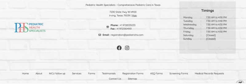
Users instinctively scroll down to the footer because they expect to find details about your practice and website there.
So, ensure your website footer content includes your medical practice’s contact information, your site’s navigation options, social media links, a sitemap, and your legal and privacy policies.
Adding timings in the footer isn’t mandatory, but it’s very convenient for your patients.
You can use sites like Unsplash and Pexels to get free images for website design.
However, you should have a clear purpose when incorporating images, videos, animations, and other media into your web pages. Users are likely to remember these elements more than they can recall the text on your website, so choose the visuals wisely.
Keep in mind, though, that videos, animations, and large images can take a long time to load. Free tools like TinyPNG can help you optimize your images to significantly reduce the loading time.
As for animations, too much of these anywhere on the site is likely to annoy the website visitor, apart from hampering your site’s speed. For example, if things keep popping in on your website, blocking what the patient is trying to read, they might get irritated and leave your site altogether.
Site accessibility means that anyone should be able to use your medical website, including people with limitations or disabilities that might affect their user experience. It is also mandated under the ADA. As per the Web Content Accessibility Guidelines (WCAG), your site must have clear functionality, understandable content, and easy-to-use navigation.
As an example, it’s important to ensure that the contrast ratio of your medical website’s colors meets the WCAG AA test standards. Regular text on the site should have a contrast ratio of 4.5:1, whereas that of headings and other larger text (18 pt or 14pt in bold) should be 3:1. There are dozens of such rules! And it doesn't stop there - the digital patient forms on your website need to be accessible, too.
Read: 18 Tips for Online Patient Form Design
You can test whether your site meets all WCAG standards using the Accessibility Checker. Simply enter your site URL in the text field and click the ‘Check website’ button.

Over 70% of professional web designers believe a website that’s not mobile-friendly prompts most users to leave the site. In short, to provide a great user experience for your medical website visitors, your site must be compatible with all devices - desktop, tablet, and mobile. That’s known as a responsive site.
Hence, your medical practice website is responsive if its content (text, images, videos, and so forth) gets automatically resized depending on the device your site visitor is using. For example, the main navigation menu on your site should automatically change into a hamburger menu (three horizontal bars) or something similar on a mobile device for the site to be responsive.
Another example is that the font typeface should be readable across different devices and screen sizes. To check whether your site is mobile-responsive, use Google’s Mobile-Friendly Test.
Patients who visit your medical practice website implicitly expect a great user experience. If you fail to meet their expectations, they’ll move on to your competitors’ websites and might even book an appointment with them. That’s why with every site design decision, you should try to make the site visitors’ experience as pleasant as possible by thinking about what’s best for them.
Of course, every medical practice website design isn’t going to please every patient of yours. But to make most of them feel at home, you need to incorporate all of the above factors as well as tons of other principles.
The drawback here is that all this takes time. Doctors like you should spend more time improving their patients’ lives than their own medical websites. That’s why Practifly is here to help you!
Armed with years of experience, our expert medical web design team can implement these and other medical website design tips to improve your site’s performance and increase your patient leads. Most importantly, we understand the nuances and the specific design requirements of top-performing medical practice websites.
Book a demo with us today to know how we can help you grow your practice with our medical website design and development platform.
Join over 3,200 subscribers and keep up-to-date with the latest innovations & best practices in Healthcare IT.
The way patients interact with your practice often begins long before they ever set foot in your office. It …

An eye-catching healthcare website design isn’t just about aesthetics and content - it’s about seamless …

Regardless of your medical practice’s specialty, chances are, your practice website has at least one patient …