
Part 1 - Scrumming the Right Metrics: Driving Proactive Financial Monitoring in Healthcare
Here is a good idea. Analytics for Healthcare financial management to be built on the foundation of claims …

The healthcare landscape is characterized by escalating costs and an increasing demand for operational efficiency and improved patient outcomes. In this complex environment, leveraging data analytics is no longer optional but essential for survival and success. This article presents a deep dive into a suite of healthcare analytics dashboards, elucidating their utility for various stakeholders. The dashboards encompass critical metrics derived from healthcare claims and encounter data, focusing on monthly volumes, service utilization patterns categorized by Current Procedural Terminology (CPT) codes and Clinical Classifications Software Refined (CCSR) categories, diagnosis distributions based on International Classification of Diseases, Tenth Revision, Clinical Modification (ICD-10-CM) codes and their CCSR categories, and pharmacy trends tracked via National Drug Codes (NDC) and Anatomical Therapeutic Chemical (ATC) classification levels.
Furthermore, the dashboards incorporate financial dimensions by analyzing billed versus paid amounts across these coding systems. The purpose of this analysis is to provide deeper knowledge regarding the interpretation of these dashboards, highlight interesting analytical applications, and illustrate how organizations can translate these data visualizations into tangible business outcomes, such as cost reduction, efficiency improvements, enhanced population health management, and optimized pharmacy benefits. The methodology involves dissecting the purpose and interpretation of each dashboard type (bar charts for trends, pie charts for distribution, bubble charts for multi-dimensional analysis) based on the underlying data definitions and industry best practices for data visualization.
Effective utilization of the dashboards requires a clear understanding of the fundamental data elements and classification systems they represent.
CPT codes, maintained by the American Medical Association (AMA), provide a standardized, uniform language for reporting medical, surgical, radiology, laboratory, anesthesiology, and evaluation/management (E/M) services and procedures performed by healthcare professionals. These five-digit codes (mostly numeric, sometimes alphanumeric) are essential for streamlining claims processing, developing medical care review guidelines, and enabling advanced analytics on service utilization. Dashboards focusing on CPT codes allow for detailed analysis of procedural volume, costs, and reimbursement patterns.
While individual CPT codes offer granularity, analyzing trends across thousands of codes can be challenging. The Clinical Classifications Software (CCS), developed as part of the Healthcare Cost and Utilization Project (HCUP) sponsored by AHRQ, provides a method for aggregating procedure codes (including CPT) into a manageable number of clinically meaningful categories. Dashboards using CPT CCS Categories provide a higher-level view of service utilization trends and cost distributions across related types of procedures, facilitating easier identification of shifts in major service lines (e.g., surgical vs. diagnostic imaging).
The International Classification of Diseases, Tenth Revision, Clinical Modification (ICD-10-CM) is the standard system used in the United States for coding and classifying patient diagnoses, symptoms, and reasons for visits across all healthcare settings. Dashboards utilizing ICD-10-CM codes enable analysis of disease prevalence, diagnostic patterns, and associated costs.
Similar to the categorization of procedure codes, the CCSR for ICD-10-CM diagnoses aggregates the extensive list of over 70,000 ICD-10-CM codes into approximately 530+ clinically meaningful categories, organized across 21 body systems (e.g., INF for Infectious Diseases, CIR for Circulatory System, RSP for Respiratory System). Dashboards leveraging Diagnosis CCSR Categories provide a valuable system-level or condition-group view, making it easier to track trends in broad disease areas (e.g., monitoring increases in respiratory or circulatory conditions).
The National Drug Code (NDC) is a unique, universal product identifier for human drugs in the United States, assigned by the Food and Drug Administration (FDA). The standard NDC is a 10-digit, 3-segment number identifying the labeler (manufacturer/distributor), the product (specific strength, dosage form, formulation), and the package size/type. For claims processing under HIPAA, NDCs are typically reported in an 11-digit format, achieved by adding a leading zero to one of the segments to create a standard 5-4-2 configuration. NDCs are required for reporting pharmaceuticals dispensed by pharmacies and physician-administered drugs in outpatient settings. Dashboards based on NDC codes allow for highly specific tracking of drug utilization, spending, and reimbursement at the package level. Analyzing NDC data is critical for pharmacy benefit management and understanding drug cost drivers.
The Anatomical Therapeutic Chemical (ATC) classification system, maintained by the World Health Organization (WHO), categorizes active drug substances based on the organ system they act on and their therapeutic, pharmacological, and chemical properties. Dashboards using NDC ATC4 Categories group specific NDCs based on their therapeutic or pharmacological action at the 4th level. This allows for analysis of trends and costs within specific drug classes (e.g., all Biguanides, all ACE inhibitors), providing a broader view than individual NDCs while retaining clinical relevance.
Understanding the distinction between billed and paid amounts is fundamental to interpreting the financial dimensions of the dashboards.
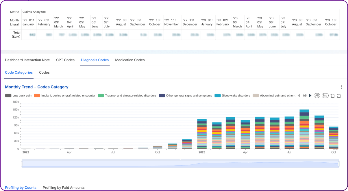
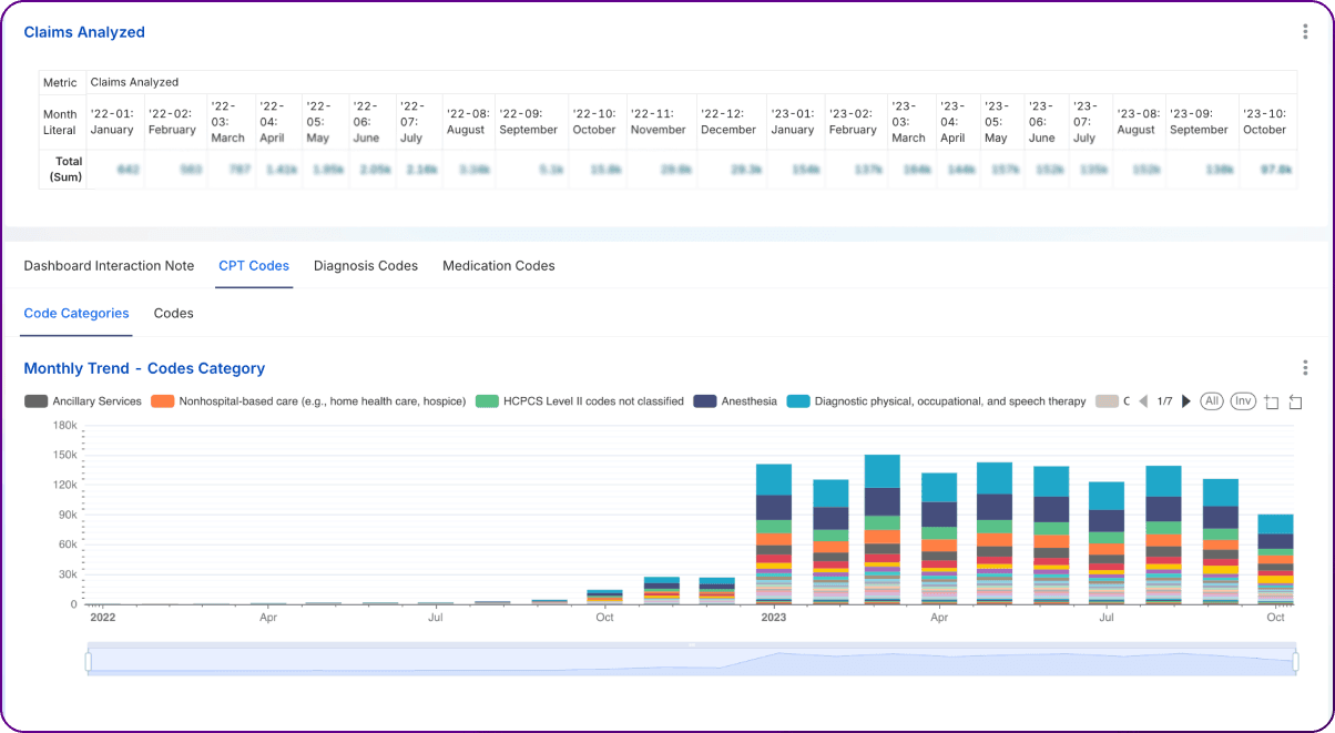
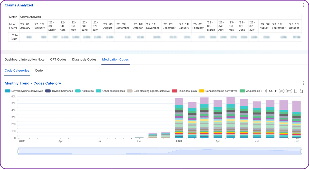
Bar charts depicting monthly trends in claim volume, encounter counts by various categories (CPT CCS, CPT Code, Diagnosis CCSR, Diagnosis Code, NDC ATC4, NDC Code) serve as foundational tools for monitoring operational tempo and identifying shifts over time.
The primary purpose of these dashboards is to visualize changes in volume month-over-month. By tracking these trends, analysts can identify:
Interpretation involves examining the patterns visually, looking for sustained upward or downward trends, sharp increases or decreases, and recurring peaks or troughs. Comparing trends across different dashboards is also valuable; for example, observing if a rise in encounters for a specific Diagnosis CCSR category corresponds to an increase in related CPT codes or NDC codes.
Monitoring these trends provides significant strategic value:
A supporting table could summarize key observations from the bar charts over a defined period (e.g., last 12 months):
| Metric/Category | Trend Observation | Potential Implication/Action Item |
| Monthly Claim Volume | Stable, slight lag vs. Encounter growth | Monitor billing turnaround time; potential backlog? |
| Encounters: CPT CCS - SURG | Increasing by 5% month-over-month (MoM) | Increased surgical demand; assess capacity/resource allocation. |
| Encounters: CPT 99214 | Spiked sharply 2 months ago, now normalizing | Investigate the cause of the spike (e.g., coding change, specific event). |
| Encounters: Dx CCSR - RSP | Seasonal peak Nov-Feb, higher than last year | Anticipate a higher respiratory illness burden next season; plan resources. |
| Encounters: Dx Z00.00 | Decreasing steadily | Shift away from the general adult medical exam code? Further analysis needed. |
| Encounters: NDC ATC4 - C09A | Gradual increase over 12 months | Rising use of ACE inhibitors aligns with population health programs. |
| Encounters: NDC | Sharp drop after formulary change | Confirm formulary compliance; monitor therapeutic alternatives. |
Below are some example dashboard images:
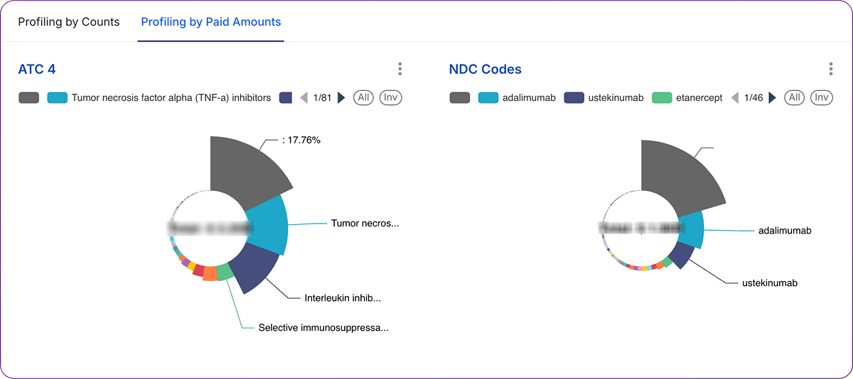
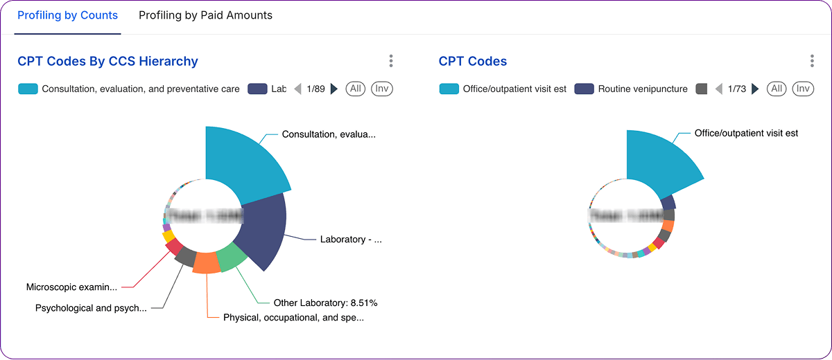
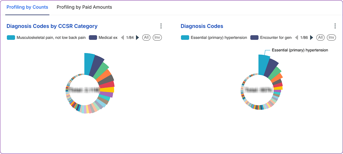
Pie charts provide a snapshot of how the whole is divided into parts at a specific point in time. In this context, Dashboards use pie charts to illustrate the proportional distribution of encounter counts and paid amounts across various code categories (CPT CCS, CPT Code, Diagnosis CCSR, Diagnosis Code, NDC ATC4, NDC Code) within a given month.
The primary goal of these pie charts is to show the relative contribution of each category to the total volume (encounters) and total cost (paid amount) for the selected period. Interpretation focuses on:
Analyzing distributions via pie charts offers significant value:
A summary table can capture key findings from comparing encounter and paid amount distributions for a specific category type (e.g., CPT CCS Categories):
| CPT CCS Category | % of Total Encounters (D4) | % of Total Paid Amount (D4) | Observation | Potential Action Item |
| SURG - Surgical | 15% | 35% | High cost per encounter category. | Analyze specific CPTs within SURG; review costs. |
| MED - Medical | 40% | 30% | High volume, moderate cost contribution. | Monitor utilization trends; ensure efficiency. |
| RAD - Radiology | 25% | 10% | High volume, relatively low-cost contribution. | Verify reimbursement rates; assess efficiency. |
| LAB - Laboratory | 18% | 5% | Very high volume, lowest cost contribution. | Ensure appropriate utilization; manage supply costs. |
| OTH - Other | 2% | 20% | Low volume, disproportionately high cost. | Investigate specific codes within 'Other'. |
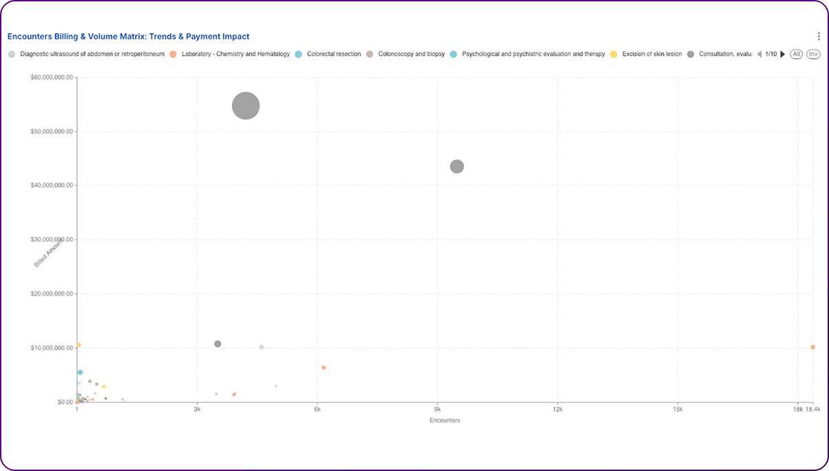
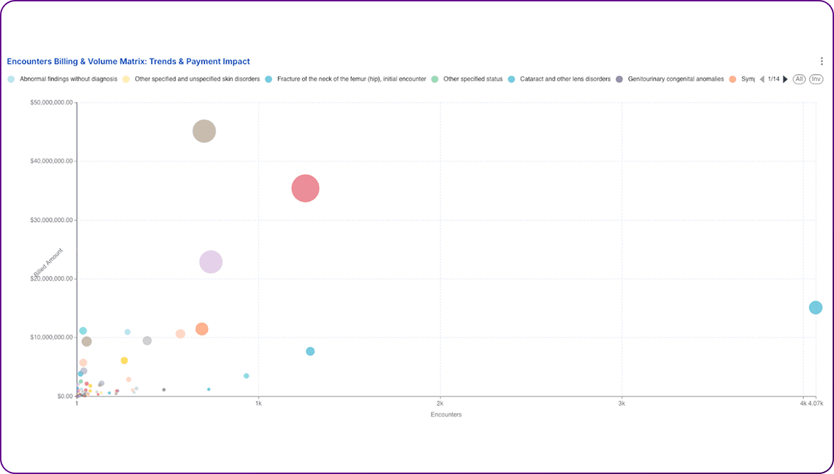
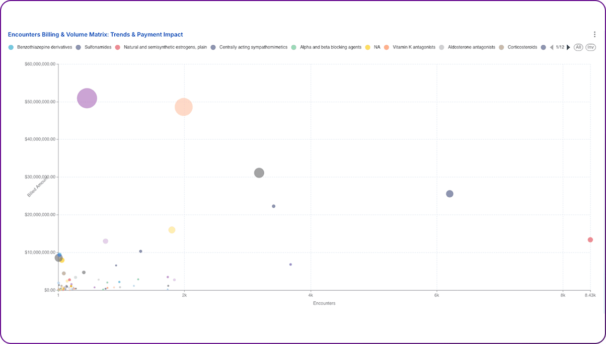
Bubble charts offer a powerful way to visualize the relationship between three numeric variables simultaneously. Dashboards utilize this format to plot Billed Amount on the Y-axis, Encounter Count on the X-axis, and Paid Amount represented by the bubble size.
These dashboards allow for a multi-dimensional analysis of individual codes (CPT, Dx, or NDC) based on their billing, volume, and reimbursement characteristics. Key interpretations include:
Bubble charts provide unique analytical power:
A table can summarize the characteristics and implications of codes falling into different conceptual quadrants of the bubble chart:
| Quadrant | X-Axis (Encounters) | Y-Axis (Billed Amt) | Bubble Size (Paid Amt) | Interpretation & Implication | Example Action |
| Top Right | High | High | Large | Major volume & revenue drivers. Core services. | Monitor efficiency, ensure optimal reimbursement. |
| Top Right | High | High | Small | Potential Underpayment. High volume, but low reimbursement relative to charges/peers. | Investigate payer contracts, denials, and coding accuracy. |
| Bottom Right | High | Low | Small/Medium | High volume, low complexity/cost services. | Focus on operational efficiency, workflow optimization. |
| Top Left | Low | High | Large/Medium | High-cost, low-frequency procedures/drugs. | Review medical necessity, cost-effectiveness, and alternatives. |
| Bottom Left | Low | Low | Small | Low volume, low complexity/cost services. | Generally lower priority unless trends change significantly. |
| Outliers | Varies | Varies | Varies | Anomalous data points. | Investigate for data errors, unique cases, or potential FWA. |
Realizing the full potential of these healthcare analytics dashboards requires a structured approach to interpretation, investigation, and action. The visualizations are starting points, not end points; they generate questions that need further exploration.
1. Establish Clear Ownership and Review Cadence: Assign specific individuals or teams responsibility for monitoring particular dashboards or key performance indicators (KPIs) derived from them. Integrate the review of dashboard trends and outliers into regular operational meetings, such as weekly revenue cycle huddles, monthly service line performance reviews, or quarterly PBM assessments. Consistent monitoring ensures the timely identification of emerging issues or opportunities.
2. Prioritize Investigations: The dashboards will likely reveal multiple trends and outliers. Focus analytical resources on the areas with the greatest potential impact. Use the summary tables proposed in Sections 3, 4, and 5 as frameworks for prioritization: target the fastest-growing cost categories (bar charts), the largest segments of spending (pie charts), and codes exhibiting the most significant reimbursement discrepancies (bubble charts – e.g., high-volume/high-billed/low-paid).
3. Conduct Root Cause Analysis: Identifying a trend or outlier is only the first step. It is critical to investigate the underlying reasons ('the why') before implementing solutions. This involves exploring several potential causes:
4. Develop Targeted Interventions: Based on the findings from the root cause analysis, design and implement specific, measurable actions. Examples include: targeted provider education on coding or documentation for specific CPT/Dx codes; redesigning clinical or administrative workflows; optimizing Electronic Health Record (EHR) templates or decision support tools; initiating payer contract renegotiations for underpaid codes; updating UM criteria or prior authorization requirements; adjusting pharmacy formularies or PBM contracts; or launching targeted population health programs for high-risk/high-cost groups identified through diagnosis analysis.
The suite of analytics dashboards examined in this report provides a powerful, multi-dimensional lens through which organizations can view their operational and financial performance. From tracking high-level volume trends with bar charts, understanding cost and utilization distributions with pie charts, to performing nuanced reimbursement analysis with bubble charts, these tools offer critical visibility into patterns driven by CPT, ICD-10, and NDC codes.
5. Enhance Dashboard Design and Interactivity: Continuously improve the usability and effectiveness of the dashboards themselves.
6. Integrate Data Sources: While each dashboard offers valuable insights, combining data across CPT, Diagnosis, and NDC views provides a more holistic picture. For example, correlating a spike in a specific diagnosis with subsequent increases in related procedures and medications. Where feasible, integrate dashboard data with other relevant sources, such as clinical quality metrics, patient satisfaction scores, detailed EHR data, or social determinants of health information, to provide richer context for analysis.
7. Measure Impact and Iterate: Track the results of interventions implemented based on dashboard findings. Measure changes in the relevant KPIs (e.g., reduction in denials for a targeted CPT code, decrease in cost per case for a specific diagnosis, improved paid-to-billed ratio after contract renegotiation). Use this feedback to refine strategies and demonstrate the return on investment (ROI) of the analytics efforts, fostering a continuous improvement cycle (e.g., Plan-Do-Check-Act).
However, the true value is unlocked not merely by viewing the dashboards, but through rigorous analysis, critical interpretation, and the translation of observations into concrete, data-driven actions. Effectively leveraging these tools requires a commitment to investigating outliers, understanding root causes, and implementing targeted interventions across clinical, operational, and financial domains. Success hinges on fostering a data-literate culture, establishing clear ownership, and integrating these analytical insights into routine decision-making processes.
Organizations that successfully harness the capabilities represented by these dashboards – moving beyond simple data presentation to active analysis and strategic response – will be significantly better positioned. They can more effectively navigate the complexities of the modern healthcare landscape, optimize resource allocation, reduce unnecessary costs, enhance operational efficiency, improve pharmacy benefit management, strengthen population health initiatives, and ultimately achieve sustainable success in an increasingly data-driven environment.
If you want to build this dashboard or need consulting help with ideas/content discussed in this article, get in touch with us—we’d love to help you turn data into action!
Join over 3,200 subscribers and keep up-to-date with the latest innovations & best practices in Healthcare IT.
Here is a good idea. Analytics for Healthcare financial management to be built on the foundation of claims …

The healthcare sector is under constant obligation to meet regulatory requirements and demonstrate fiscal …

Data-driven decisions are the way of the future. Not only is there wisdom in using facts versus assumptions to …