
How to Track Search Intent of Likely Patients: A Beginner’s Guide
The way patients interact with your practice often begins long before they ever set foot in your office. It …

Regardless of your medical practice’s specialty, chances are, your practice website has at least one patient form. It may be a simple appointment request form or a long patient health chart, depending on what information your practice needs.
Essentially, your patient should be able to complete the form quickly and without any confusion. You might think this is common sense now, but when designing patient forms, it gets easy to lose sight of this trivial, but basic, norm.
This blog post describes some form design best practices that’ll enable you to deliver faster and easier patient experiences.
A patient-friendly form design can help you increase conversions for your medical practice.
How? Well, the moment your patients come across a nicely-designed patient form on your practice website, they get the notion that your practice is helpful and that you think about their convenience.
When potential patients find your new patient forms sleek and easy-to-use, they’re happy to fill those out and become your new patients.
On the other hand, a poorly-designed patient form might prompt your patients to leave the form as well as your website.
Every online patient form (or any form, for that matter) is typically made up of the following 6 components:
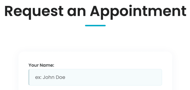
A patient form should always have a title that tells users what the form is for. For example, an appointment request form can be titled, ‘Request an Appointment’.
Input fields or form fields may include radio buttons, checkboxes, text and numeric fields, and any other field designed for patients to enter their information.

Placeholder text is the light-gray text in a form field that provides the patient with an example of the information they need to fill in.
A label tells the patient what information the corresponding input field or form field is asking for.
For instance, if a field has a label saying ‘Email’, the patient will understand they’re supposed to fill in their email address in that field.

A patient clicks a call-to-action (CTA) action button to perform an action. For instance, a ‘Submit’ button in a patient form is a CTA button, since clicking it would trigger form submission.

On submitting online patient forms, most of them notify the patient that the form has been submitted successfully. The patient might also get a simple ‘Thank you’ message that indicates the form has been submitted.
Here are 18 online patient form design best practices to help you create and deliver a good patient experience:
Let’s say a patient has visited your clinic for the first time. Would you kick off the conversation by asking them for their address or about their medical condition, rather than asking their name first? No.
In the same way, your online patient form should ask for information in a logical sequence. It would be unusual to ask for someone’s email address before asking them their name.
Your form should start with the easiest questions, such as the patient’s name, date of birth, and email address. Keep the time-consuming questions, like the patient’s detailed medical history and insurance information, toward the end of the form.
Seeing a form structured in this manner, a patient might think filling it up would be easy - because anyone can quickly add their name and email! They’re then less likely to leave the form after they’ve already filled out the first half or the first page of the form. But they might abandon the form if they see that the very first field asks for their insurance details.
Imagine you’ve been handed an online form during a doctor visit, where some fields are stacked side-by-side and some aren’t.
It’s frustrating enough to complete a long form. On top of that, trying to understand the form would feel like more of an extra job and a waste of time. You might even be tempted to abandon the form altogether!
That’s why, when creating long, multi-step patient forms, use a single column, instead of more than one column.

For one thing, a single-column form layout lets patients (even those with disabilities) easily scan, understand, and fill in each field. They don’t get distracted by multiple columns, which is why it’s the best form layout to promote accessibility.
Having a single column also makes the form mobile-responsive. This means that when filling out the form on their mobile devices, your patients don’t need to scroll left and right or zoom in and out just to ensure they haven’t skipped a field.
Finally, patients can complete a single-column form about 15 seconds faster than a multi-column one.
Your digital patient forms should group related questions into logical or appropriate blocks. For example, you can have a Personal Information section, containing the ‘Name’, ‘Email address’, ‘Date of birth’, and ‘Phone number’ fields. Meanwhile, the ‘City’, ‘State’, ‘Country’, and ‘Zip Code’ fields can be neatly tucked under the Address section.

Showing a progress bar or some sort of progress indication leaves no patient wondering where they’re at during form completion, especially if it’s a multi-step form.

Exclude any unnecessary fields from your digital patient forms. When wondering if you should include a certain field in the form, ask yourself if you really need the patient to fill up that field in order to achieve the form’s goal.
For example, an appointment request form may contain fields for the patient’s name, email, phone number, and the preferred appointment date. Would you also need their Social Security Number (SSN) in the same form? Not likely.
That being said, the less effort a potential patient has to put into completing your online form, the higher the chances of their conversion. Therefore, reduce the number of form fields as much as possible.
Your field labels should be short (not more than 3 words at best) but descriptive, so patients can quickly skim through your form. For example, instead of a long label like ‘Preferred Date of Appointment’ in an appointment request form, you can shorten it to ‘Preferred Date’.
Proper label use is also important for all the form fields. Labeling a field as ‘Birth Name’ instead of ‘Name’ would be pointless.
Aligning all the form text to the form’s left side makes the patient form more readable. This is because the natural left alignment reduces the effort a patient’s eyes need to put in to jump across the form page and read the text.
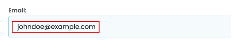
The placeholder text in an ‘Email’ field may say ‘johndoe@example.com’. This text is meant as a written prompt to help the patient enter their email address in the correct format.
But if the placeholder text says ‘Name’ for a field already labeled ‘Name’, like in the image below, you might as well not add the placeholder text at all.
Despite adding a label and a placeholder text in a patient form field, a patient might not completely understand exactly what information you’re asking for. For these kinds of situations, you can show Help text in the patient form.

Even after you reduce the number of form fields in the patient form, there may be some fields or answers that would be good to have, but are left to the patient’s discretion to fill them up. These fields are known as optional fields.
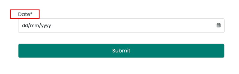
However, there are a few form fields, without filling which, achieving the form’s goal would be impossible. Known as ‘required’ or ‘mandatory’ fields, these may include the patient’s name and email address.
A patient form design best practice is to clearly distinguish between mandatory and optional form fields. The general norm is to use the word ‘optional’ for non-mandatory fields or mark mandatory fields with an asterisk sign ‘*’.
Validation errors or error messages are an effective way to ensure that the patient’s information in the form is accurate.
Unfortunately, some private practices show a long list of errors only after the patient has filled out the entire form. This means that the patient would have to remember the errors and then go back to each form page to correct those errors before submitting the form again.
Nobody has enough time or patience to do that, not even you!
Instead, your patients would appreciate it if you showed them a validation error after an incorrectly-filled form field, and not after an incorrectly-filled form.

For instance, if the patient has forgotten to fill up the ‘City’ field in the Address section, it’s better to let them know so after they’ve kept the field blank and moved on to the next field.
Asking them to fill the ‘City’ field after they’ve completed the whole form would mean that they have to return to the page containing the ‘City’ field, fill it up, move forward through the next pages again, and then re-submit the form.
Utilizing predictive search for certain form fields would immensely save the patient’s time.
For example, let’s say the patient’s filling out the ‘State’ field in the Address section. They should only need to type the first few letters, like ‘Ma’, before only 2 options - Maryland and Massachusetts - show up in the dropdown menu, and they pick one option.
In this case, the patient doesn’t have to waste time combing through all of the options in the dropdown menu before selecting one. Neither is there any possibility of their typing information that’s wrongly spelled.
Predictive search thus creates a smoother form completion experience for your patients, enabling them to fill up the form more easily and quickly.
The Call-to-Action (CTA) button at the end of the patient form should clearly state the button’s purpose. An Authorization to Request form, for instance, should end with a CTA button saying ‘Submit’ instead of ‘Thank You’. Make sure the button looks clickable, too.
Further, long, multi-page patient forms should come with a ‘Back’ or ‘Previous’ button and a ‘Next’ or ‘Proceed’ button.

Suppose you’ve entered your information in a long form. But after all that work, you find a fairly hard-to-understand CAPTCHA you have to decode and type in a form field before you can submit the form.
And this is just to prove you’re not a robot. Annoyed? Your patients would be, too.
Instead, why not use a reCAPTCHA? With reCAPTCHAs, all your patient needs to do is check a box saying something like “I’m not a robot” before submitting the form.
A modern reCAPTCHA service, like Google reCAPTCHA or Cloudflare Turnstile, can help you implement reCAPTCHAs on your online patient forms to provide a seamless user experience for your patients.
You need to design every patient form on your practice website with accessibility in mind.
Doing so will ensure that a wide range of people can use these forms, no matter what physical, visual, or sensory disabilities they may have. For instance, when zooming in to your form, the text shouldn’t get pixelated.
Color contrast is another crucial factor here. According to the Web Content Accessibility Guidelines (WCAG) 2.1 Level AA, the contrast ratio should be at least 3:1 for large text and 4.5:1 for normal text. Use this free Contrast Checker tool to help with that.
The US is now home to over 300 million smartphone users. As if that wasn’t enough, people spent an average of 4.5 hours daily on their phones, as of April 2022. Both of these figures are expected to keep rising in the coming years.
That’s why you should make sure your digital patient forms are mobile-friendly or mobile-responsive. In other words, the forms should look good and function like they’re meant to, on mobile devices. All of the patient form information should fit the mobile screen so the patient can easily view and complete it on their smartphone.
For example, the text (font style and size) should be legible on the small mobile screen, so no patient has to zoom in to read the text.

Last but not the least, always test an online patient form for usability, after creating it. This will help you identify any issues that might pop up when filling out the form.
Accordingly, you can rectify those issues and improve the form’s functionality so patients get a smooth experience from the beginning of the form till form submission.
For instance, on loading a patient form, check if all the labels, Help text, form fields, placeholder texts, radio buttons, and dropdown menu options are loading correctly and quickly.
In case of radio buttons or checkboxes, ensure the text corresponding to each button appears in line with the button, and not above or below it. These little things matter!
So, scrutinize the entire form till you’re completely satisfied with its usability, and then launch it on your practice website.
Think about the digital patient forms that are already published on your practice website, and those that you need to build on your site. Are they built for your patients’ convenience? At the same time, are they aligned with your practice’s goals?
For example, let’s say you own a pediatric practice, and your primary goal is to offer a NICU follow-up program. In that case, does your website feature a NICU follow-up form that parents can fill up to avail of this service at your clinic?
By implementing the patient form design best practices we’ve explained above, you can provide your potential patients with a positive experience that turns them into your new patients.
However, if you’re busy running your practice and treating your patients, you might be strapped for time. No worries! Our incredible UI/UX design team at Practifly are experts at designing and building online patient forms that apply best to your practice’s goals and drive more leads for your practice. So, book a free consultation with us today!
Join over 3,200 subscribers and keep up-to-date with the latest innovations & best practices in Healthcare IT.
The way patients interact with your practice often begins long before they ever set foot in your office. It …

An eye-catching healthcare website design isn’t just about aesthetics and content - it’s about seamless …

Our GA4 series so far has covered why you need Google Analytics 4 for your healthcare brand and how to set up …